At the University of Chicago’s 2017 “The Impact of the Digital on Japanese Studies” workshop, scholars from a variety of fields and foci questioned how digital methods are currently or could potentially change the way we approach Japanese Studies research. There, I took a critical and exploratory approach to determine how and if these tools were useful within my own work on medieval Japan mapping and analyzing sixteenth-century documentary communication networks. In experimenting with network analysis and mapping tools using a portion of my corpus as a basis, I found both great potential in reevaluating my present conclusions and knowledge through the digital as well as drawbacks to engaging these methods of analysis. Digital tools provide an innovative way to approach humanistic data that any historian may benefit from, although as with all methods, it should be employed with thoughtful caution. Below I highlight the process of mapping to visualize sixteenth-century documentary exchanges.
Sources and Goals
As an extension of my exploration of network analysis using the Matsugike monjo 真継家文書 (refer back to the network analysis page for a more detailed introduction to my source materials), for this workshop, I also decided to explore a mapping tool, Palladio, to represent my data from a cartographic perspective. One of the drawbacks of Cytoscape is its limited ability to represent visualizations geographically— there is a way to upload coordinates on an X-Y axis and overlay it with a map, but doing so is clunky and complicated by the way the data has to be input, with an edge table that refers to a node to read attributes, but which cannot have multiple attributes for a single node. In other words, if my central figure in my medieval document documents, Matsugi Hisanao, is traveling to multiple locations, he has to be labeled distinctly (perhaps with numeric additions, Matsugi 1, Matsugi 2) multiple times on the node table and appear as if he is two people. I therefore chose to look outside of Cytoscape for mapping.
Already having a set of 168 documents curated as a data set from my network analysis visualizations (visit that page for background on the Matsugi family document collection), I decided to stick with the goal of creating a visualization based on cross-status documentary exchange in the sixteenth century. Namely, I was curious about 1) if my problematic premodern documents leant themselves to being mapped, and 2) what doing that would take, and 3) if they would reveal anything new to me.
Tools and Methods
So for geographic visualizations, I went with Stanford University’s online visualization tool, Palladio, which is particularly useful for quick and easy mapping and does not require installation on one's computer. Palladio has a few different features that are useful for visualizations, including mapping, timelines, basic network graphs, data lists, and gallery features. Data sets can be uploaded as a file or copy-pasted into a data entry box, their visualization tweaked on the website, and the result then exported as a .json file you can re-upload at a later time if you wish to continue working on the same data set's product.
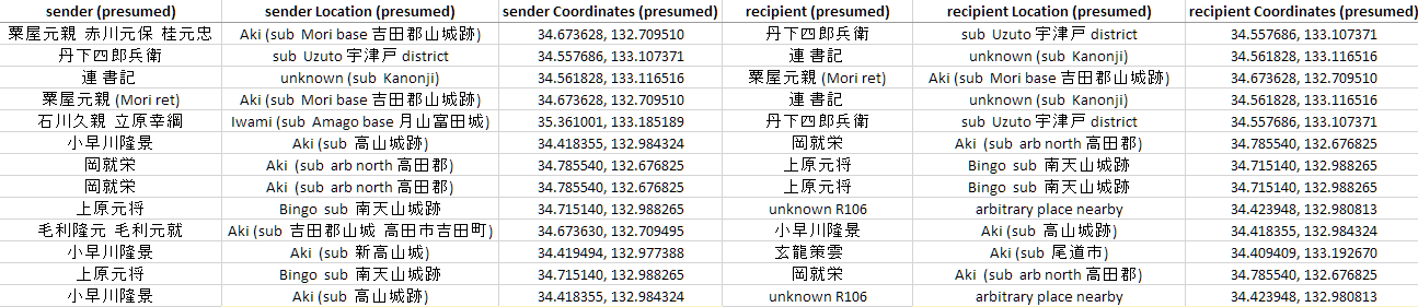
My fundamental method of visualizing two sets of data was no different than that of my network analysis visualizations. I wanted to compare two sets of data, first my collection of 168 extant documents, documents from the sixteenth century that were exchanged among courtiers, warriors, and commoners and survive in physical form, and my second collection, a data set in which those documents and additional documents that are presumed to have once existed are included. This expanded data set, based on the content of surviving materials that mention other instances of document creation ("Thank you very much for your letter." "I received your last missive." "I will send a reply immediately." "Convey these orders without delay.", etc.), allow us to explore in a more concrete way information potentially lost to history.
Visualizations and Obstacles as Methodological Process
Shifting from one platform to another for data visualization comes with the problem of cleaning one's data– in other words, formatting it properly to fit the input requirements of the particular tool being used and ensuring the data causes no errors in the system. For example, Palladio is picky about certain punctuation symbols (such as periods and ampersands), and if you are importing as a csv file (comma separated value), then a cell that includes two names separated by a comma might return errors when uploaded. The data I originally created in Cytoscape, therefore, had to be reviewed and altered to fit Palladio's needs.
After painstakingly reformatting my data to suit Palladio’s input, I then had to address the requisite data for geographic mapping: coordinates to place the senders and recipients of my documents on a global map. I hunted extensively for information on where each sender and recipient might have been when writing their letters. My selections had to oftentimes be necessarily vague and speculative. Although some documents might specifically mention a city or village, tracking that exact location down was an exercise in referencing a combination of Japanese local history collections and Google-sensei. For better known figures, such as Ōuchi Yoshitaka, it was possible to use the modern day archaeological site of their residence remains as a reference point on Google Maps. For the Yangihara, I combined examinations of Takahashi Yasuo's Kyōtō chūsei toshishi kenkyū mapping research of their medieval neighborhood and Ritsumeikan University's premodern overlay map of Kyoto to estimate where their manor once stood in the modern city of Kyoto.
If the sender or recipient was a local warrior of a small but documented family, I might only be able to find records of castles they once held centuries before in the province they resided, and took an educated guess for the sake of producing the map visualization. For artisans, my time constraints and the unknown number of individuals made it untenable to compare with archaeological records that would be the best source of information, so I envisioned their residences and workshops to be near small bodies of water close to their patrons, given that iron sand collection was used as often as mining to gather raw materials.
As mentioned, this called for an extensive amount of speculation and hypothesis. This was in part necessary because of technical obstacles: while Cytoscape accepts blank nodes in your network, Palladio does not. This meant that although I might definitively know the location for some of my documents, to leave the data blank for unknown areas was not an option. As a historian, I had a great deal of anxiety at having to simply "make up" locations based on my best guess of where an obscure person might have lived.
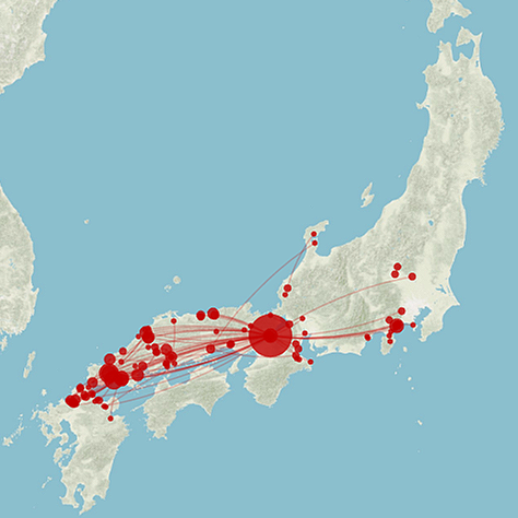
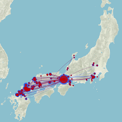
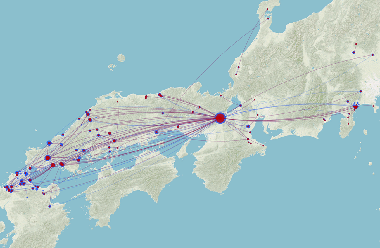
But the result of cultivating this data set (and many hours of tweaking and correcting) was a set of rather elegant-looking maps in Palladio. Seen to the right, I produced one with a single layer (red) that mapped my existing document network and another (red and blue) that overlaid both sets of data for the extant and non-extant materials in a single map visualization. This allowed for me to see the expansion of nodes caused by the inclusion of richer data.
The centrality of Kyoto, where my central figure Matsugi Hisanao typically communicated from, is visually striking as the largest red node on the map. One of the options possible in Palladio is to visualize the size of nodes as relative to their occurrence in the data set. In other words, because Hisanao sent the majority of the documents from Kyoto, the large number of sent and received letters from that location is proportioned visually on the map, appearing much larger than the rest. Similarly, areas like Yamaguchi, the Ōuchi family stronghold in the southwest of Japan, has the largest number of nodes given that it is the most prolific surviving cache of letters in the Matsugi collection and therefore creates more data points than other letters.
The scale of these nodes changes based on the zooming level used in Palladio, so below I provide a series of closer screenshots that allow you to see the detailed level with which it is possible to view your data points.
Although I did not work extensively with Palladio's mapping features (for example, including labels with my data points), this was a useful exercise in thinking about map design and the possibilities of comparative data.
Some Insights and Avenues of Exploration
One of the main benefits of creating these mapping visualizations is, much like with the Cytoscape network visualizations, creating a new way to evaluate and analyze your materials. Although my corpus was relatively small, and I had a sense that my primary areas of activity were areas like Kyoto in central Japan and Yamaguchi in the southwest, if I were less sure of to what extent those areas or others compared or if other sets of letters would reveal another geographically prominent and active area, these maps would be an excellent way to explore that avenue of thought. Small networks of communication, too, perhaps within a single province or across bodies of water, might become apparent from mapping the physical movement of letters.
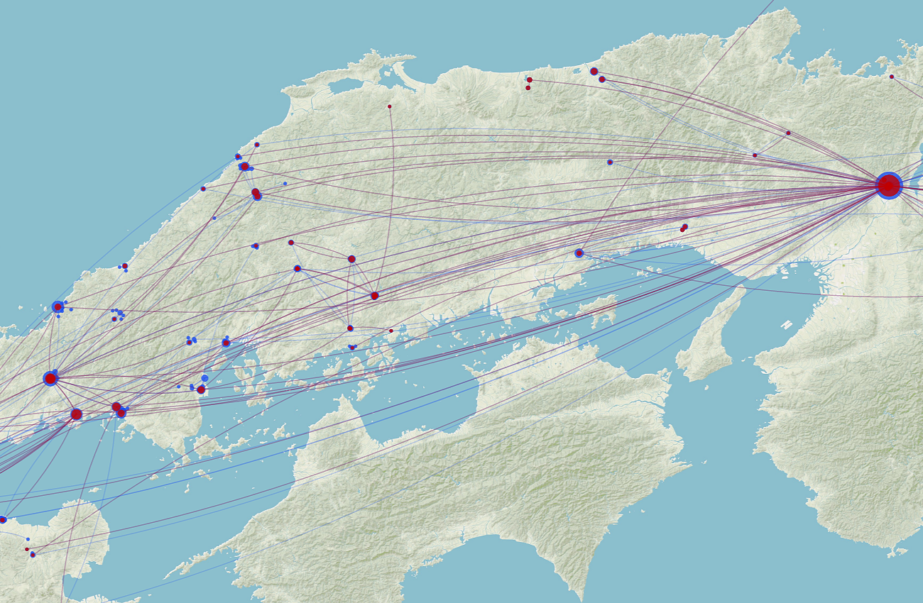
Furthermore, the comparison of my two sets of data, the extant documents and extant + non-extant documents, is also instructive in a mapping context. Compare the two maps of northern Kyushu below.
While the extant document network on the left demonstrates letter exchanges occurring among warrior retainers to the Ōuchi household as they passed down orders amongst each other to collect taxes from local artisan organizations to subsequently convey to the capital, when we actually map those theoretical exchanges with artisans whose documents may have been lost, the assumption of a great deal more documents brings new areas of potential communication to life in the form our tangles of blue dots in the right-hand map. From this, we gain a visual means of understanding (and teaching) the pervasiveness of local interactions with late medieval commoners, the evidence of which is does not survive. Such hypotheses add a great deal of complexity to our understandings of these interactions and cross-status negotiations/interactions in a society less polarized than social categorizations might suggest.
Problematics and Limitations
As with my network analysis visualizations, there are a number of issues that arise when working with historical sources and mapping tools. First and foremost is the cleaning of data. Not only is the formatting of historical materials for the needs of digital mapping tools inconvenient and time-consuming, but it also requires concessions. In Palladio, for example, the need for all nodes to be filled with content required that I "invent" data based on my best guesses to ensure that the data I did have was represented in the visualizations I wished to produce.
In the same vein, if such data is too problematic or full of gaps, it may not be able to be used at all. Although Palladio's mapping features include a timeline option that allows the use to demonstrate changes in a map over time, I hit two snags in this process.
1) My dates were all in the form of the lunar Japanese calendrical cycle used in the premodern period. This meant that I had to first enter my data based on my original documents, then painstakingly convert and format them into Western dates. I performed this process using Tsuchihashi and Zöllner's tables at the NengoCalc site.
2) However, despite the process of conversion, which in and of itself may incorporate new errors, I found that not enough of my sources included complete dates, often only having a month or day to go on, and ultimately, my communication network visualized graphically on a map was unable to incorporate changes over time that might have revealed some areas as a subject of focus during different years or decades.
Finally, there is also the dangers inherent in the tool itself, whether it be bugs in coding, or the simple fact that Palladio is hosted on the web, rather that on one's own machine. If Stanford decides one day to cease hosting the Palladio site, researchers who have used it to visualize their work or who wished to in the future are at the mercy of that access, and it is ultimately an ephemeral tool.
Conclusions
By way of a limited conclusion, I highlight that we must still ask: if the absences and obfuscations of incomplete source materials force us to hypothesize and extrapolate to extremes in order to produce numerical figures in analysis or data points for mapping, how far removed do they become from making realistic arguments about a given historical network?
The utility here is yet again not necessarily a means to produce scholarly work for publication in the highest academic journals (though that could certainly be a possibility, with careful data collection and execution). Rather, much as with the networking tools, the process of data production in and of itself can be a convenient tool as a methodological process to spark new ideas about how we create and synthesize the historical materials we cultivate as scholars. Our jobs are, ultimately, interpretive in nature, and we manipulate our data every time we mold a hypothesis or extrapolate the role of a document or person in the larger framework of the history we study. What is our job as academics if not to provide theories based on a body of knowledge that forms our expertise? While the above maps are, in my case, more demonstrative than anything else, a way to examine my larger network and ask questions about the geographic reach of cross-status relationships without concrete proof of the exact locations to which missives were sent, they should not be dismissed as wholly without value. As a methodological and pedagogical tool, these digital methods offer a convenient alternative to a map full of pins on a corkboard and present new possibilities for sharing our thoughts and process with others in a tangible way.
Return to top.